Background
Security analysts live in tables.
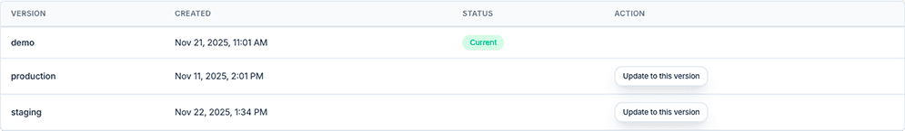
A Legal AI B2B platform helps security teams answer compliance questionnaires with AI. That means analysts spend most of their day inside tables — managing Q&A knowledge pairs, evidence documents, questionnaires, and client compliance guidelines.
Tables aren't a feature of the product. They are the product.


Problem
The cracks were small, but they were everywhere.
😕
Observation #1
A user struggled to find the action to open a processed questionnaire. The icons were small, unlabeled, and placed differently than in other views.
Observation #2
A user struggled to find the action to open a processed questionnaire. The icons were small, unlabeled, and placed differently than in other views.
😣
Aha! moment
Neither was an edge case. They were symptoms of having no shared table pattern.
APPROACH
I started with the hardest view — 600+ entries.
Q&A Pairs was the most data-dense view in the product — 600+ entries, long text in both columns, and multiple metadata fields. If the pattern worked here, it would work everywhere.
Compact row height
36–40px — analysts scan volume, not whitespace
Content-first columns
Shrank metadata, gave space to primary content
Relative dates
"2 days ago" instead of full timestamps
Consistent actions
Discoverable row actions, not scattered icons
Toolbar pattern
Standardized filter, search, and action placement
APPROACH
I started with the hardest view — 600+ entries.
Q&A Pairs was the most data-dense view in the product — 600+ entries, long text in both columns, and multiple metadata fields. If the pattern worked here, it would work everywhere.


