
Making it simple for students to join societies and find their community at Brunel University London.
Services
Research
Design System Development
Overview
University societies play a crucial role in fostering campus community, offering great benefits to those who join them - from the opportunity to connect with new, like-minded people to having something new to add to your CV, the advantages are numerous.
After noticing a disconnect between societies and students, I took the initiative to develop a platform aiming to bridge the gap between them.
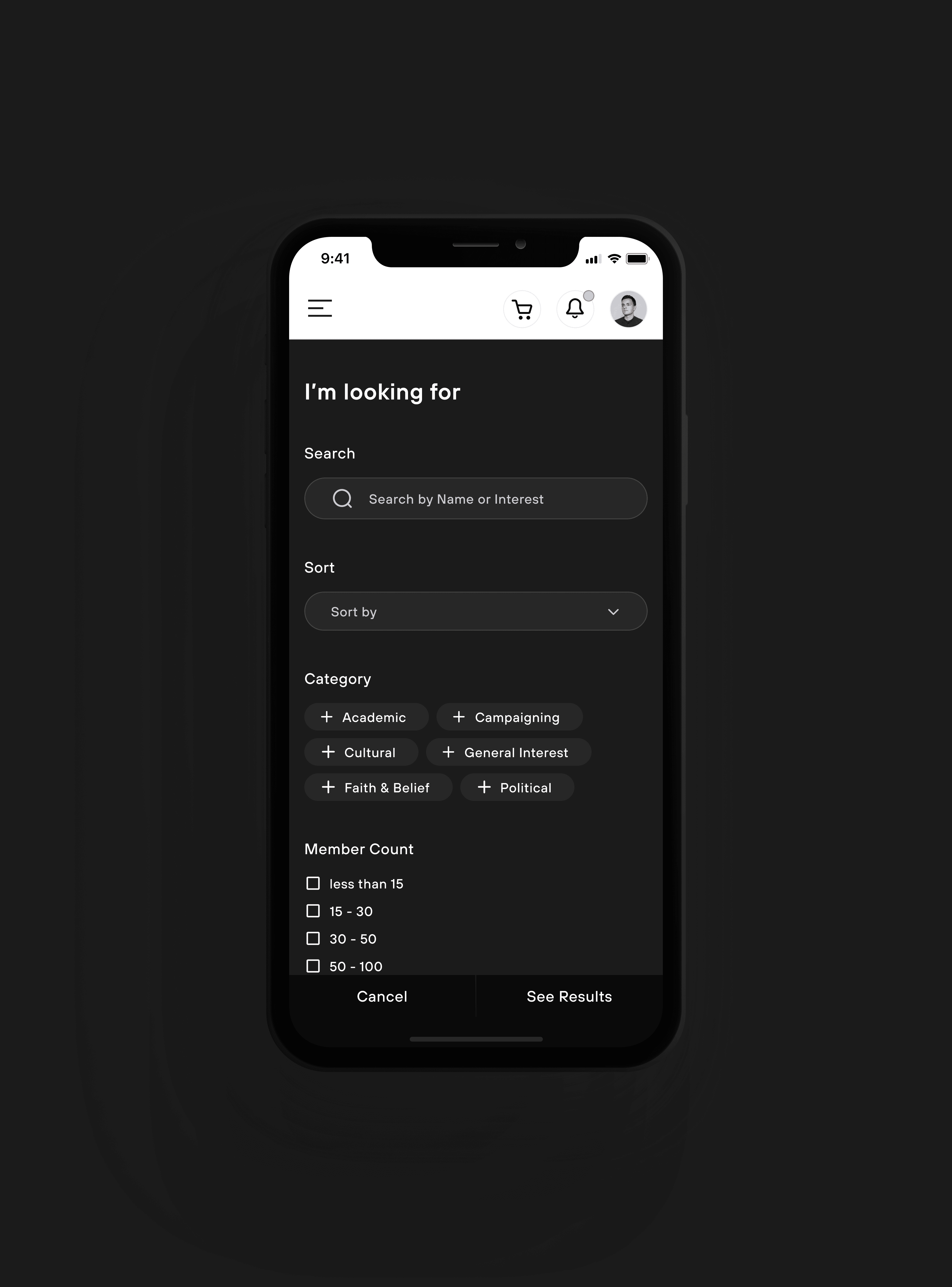
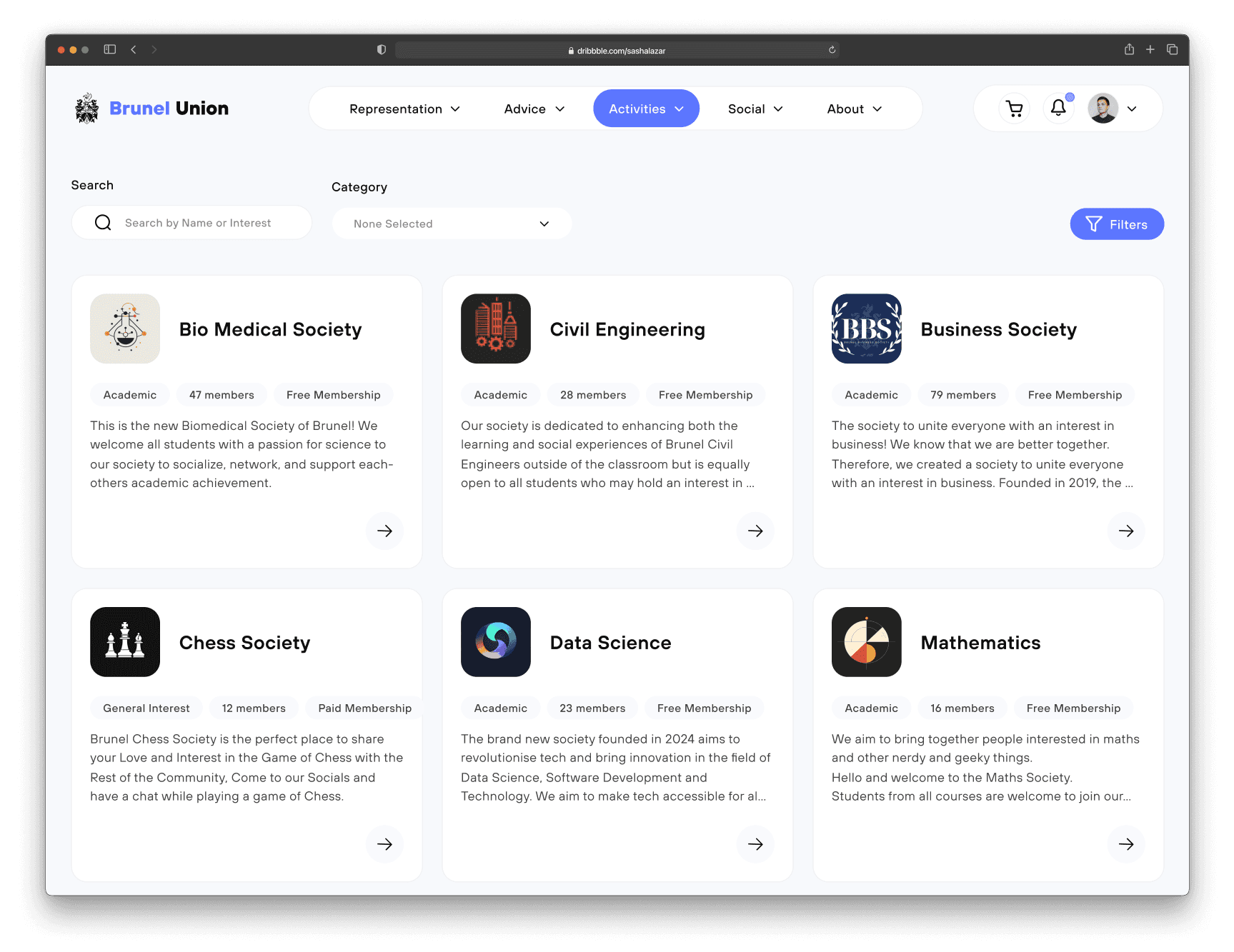
Search, Filter, Discover Societies
Searching & filtering options to help you find societies that align with your interests
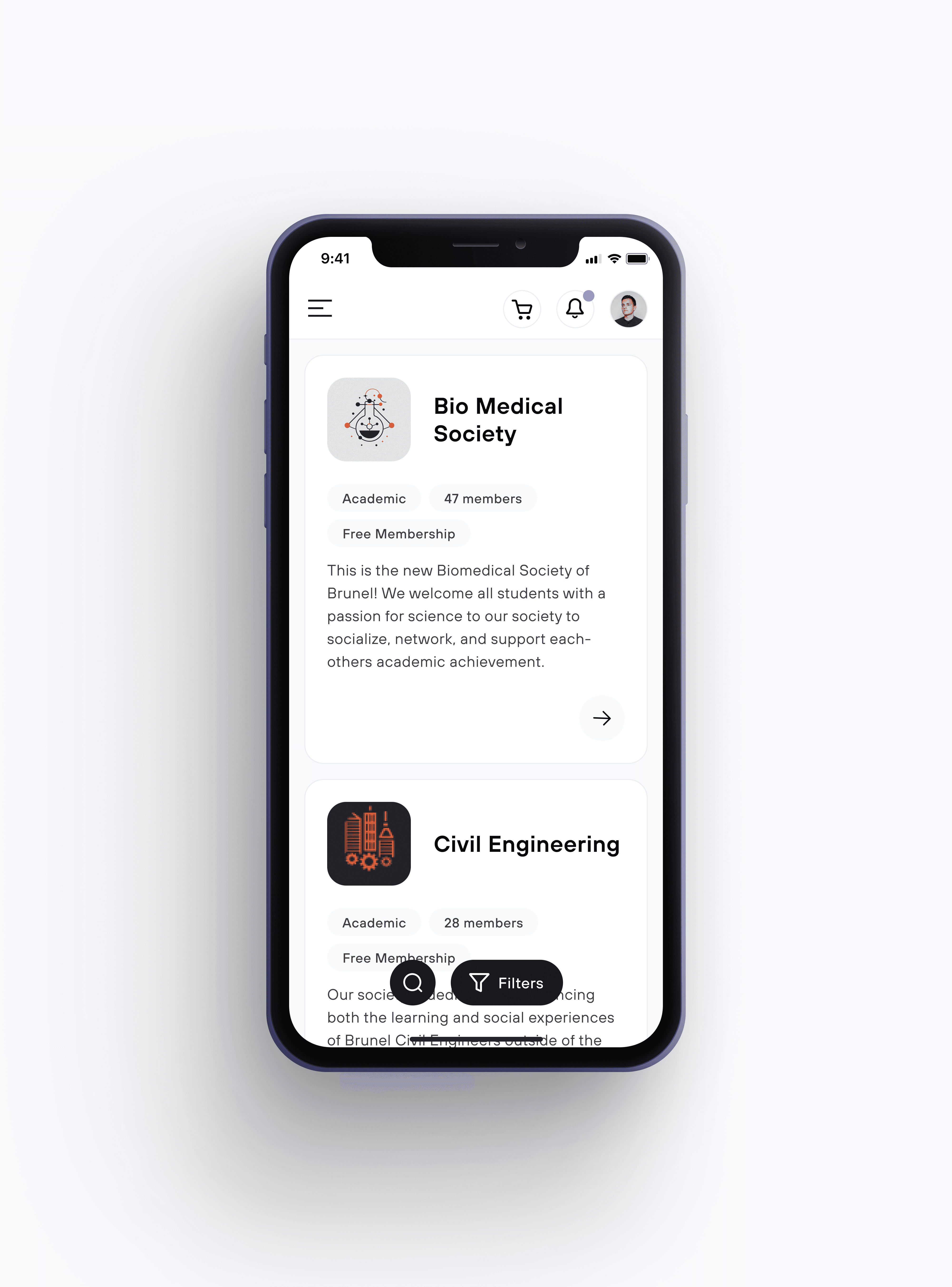
All The Information About Societies At Your Fingertips
A details page with everything you need to know about every society - from upcoming events to membership requirements. If you need to know more then feel free to contact the members directly through the website!
A modern dark mode for reduced eye strain and fatigue, particularly in low-light environments.

Your Personal Student Profile
This is your profile, showcasing your clubs, interests, contact info and similar profiles. Your listed interests help us suggest societies you may like to join.

Background
Make it simple for students to find a community that aligns with their interests
The Idea
It all started with a simple question…
It all began when I started having casual conversations with friends about university life. It was there a recurring question caught my attention: “If you could go back to university, what would you do differently?”


Observations
Participation in societies is low
Observation 1
There are 2000+ Economics and Finance students at Brunel but less than 150 have joined the Economics and Finance society.
Observation 2
Brunel has over 16000+ but less than 5% of them have joined non-sport or culture-related societies.
There is a disconnect between students and societies
Participation seemed low for a University with over 16,150 students. If most students wish to join a society, then why aren’t in one? This suggests a potential gap or disconnect between societies and students.
After noticing the disconnect, I sought a challenge:
“How might we connect students with societies that match their interests?”
Finding The Problem
All the current solutions are semi-functional
Identifying the issue and collecting valuable insights became the first step in defining the project's goals. I started by asking myself:
"How do students connect with societies?"
"What are the current solutions? Why do they not work?"
To answer these questions, I have conducted in-depth research and interviews with students from Brunel University. The analysis revealed that all the current solutions are semi-functional, exhibiting their own advantages and disadvantages.

During Freshers Week societies have tables around the campus with posters to inform students about their organization.
Pros
Lots of information about societies
Students can ask questions in person
Cons
It happens only once per year
It’s too crowded and new students are still adjusting to university life.

Instagram is another way for societies to promote themselves.
Pros
Lots of information about societies
Great way to stay updated on events
Cons
A lot of clubs don’t have Instagram
Can’t filter for information.
It’s not for discovering new societies. You need to already know the society to search for it

Instagram is another way for societies to promote themselves.
Pros
Run by Brunel Student Union
Lists every single society and club
Cons
Confusing and outdated UI
Difficult to search and filter
There isn’t enough information about society's activities and events.
Surveys
Learning more about the students
After taking a look at the current solutions and understanding the problem, I wanted to delve deeper into research to understand student pain points and motivations. I conducted primary research through surveys and gathered results from over 40 students. I have asked them questions such as:
"Why would you like to join a society?"
"What kept you from joining a society in the past?"
"What is the most important information to know before joining a society?"
"What are your thoughts on the Brunel Union website?" What do you like or dislike about it?"

Opportunities
Setting goals for the project
I envisioned crafting a platform where students could seamlessly access all the information they need about university societies. This is where the Brunel Union Web platform steps in, serving as the ultimate destination for university students to discover their new community. After analysing all the data from the research, I redefined the challenge using "How Might We" statements that address the needs of the students:
Frustration
Unclear /or lack of information on the website
Opportunity
HMW help students to easily find all the information they need?
Frustration
Feeling anxious about going to an event without knowing anyone
Opportunity
HMW relieve the anxiety of attending a society or an event alone?
Frustration
Unaware of societies that align with their interests. Most students join only societies through word of mouth.
Opportunity
HMW make it simple for students to find societies that match their interests?
Frustration
Searching for new societies through the website can be difficult and overwhelming
Opportunity
HMW encourage exploration? HMW make searching for new societies based on multiple criteria seem effortless?
Wireframes
Crafting a low-fidelity prototype
After brainstorming and sketching potential solutions, I brought my idea to an interactive digital low-fidelity prototype.

The Layout
A grid with fixed & variable sections
Establishing a set of layout grids and breakpoints, was critical in ensuring we could design and build quickly and consistently. Inspired by web platforms such as Spotify and Jira, I divided the layout into two sections. A fixed section for the sidebar and a variable section, which expands based on the screen size.
The goal is to align the container "building block" elements to the grid and create a responsive layout. However, the content inside the containers doesn't need to align with the grid.
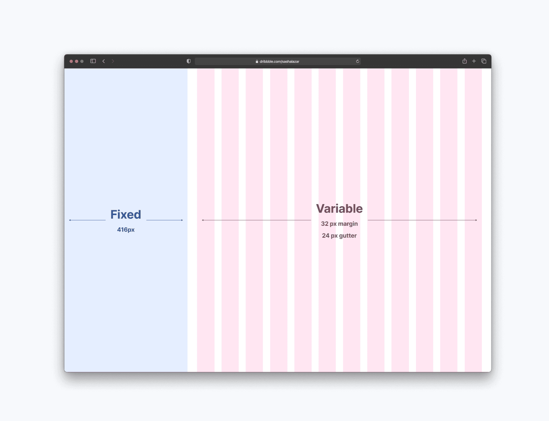
A responsive Layout
The cards are expanding to fill the grid until there is space for an additional card. However, the sidebar stays fixed on the screen. I have determined a maximum and minimum width for the cards and set the grid to 12 columns as it's divisible in multiple ways.
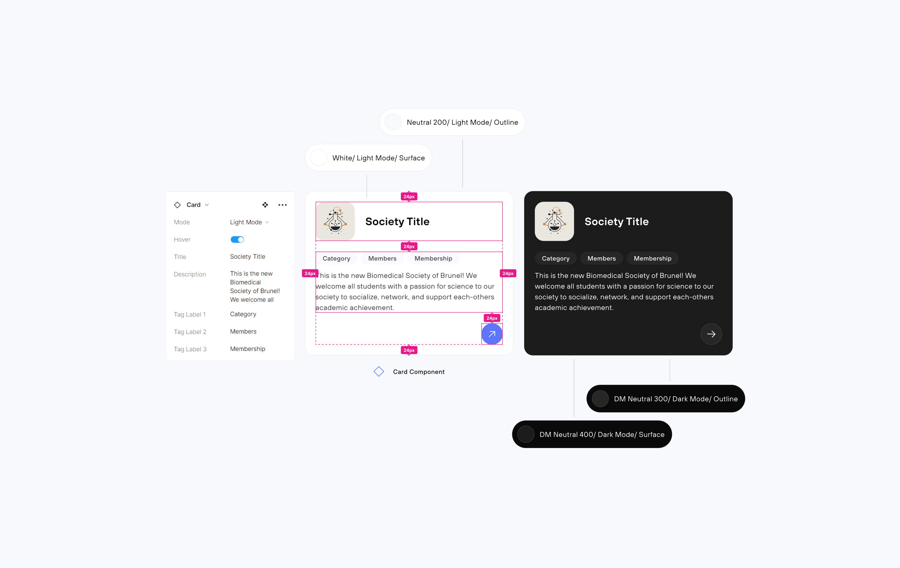
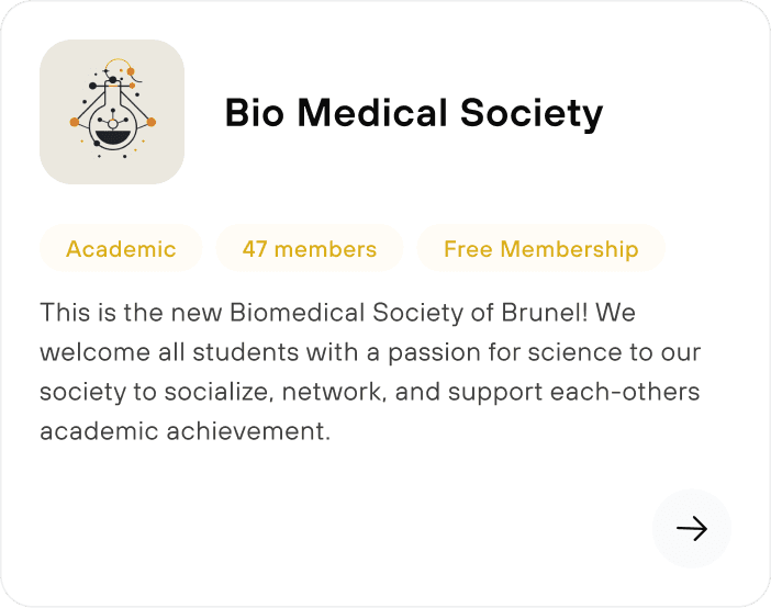
Card Visual Design
Designing the perfect society card
The Society card component was highly critical from a content organization perspective. It was designed to prioritize readability while accounting for responsiveness and flexibility. It was also an opportunity to leverage Figma’s component properties functionalities to greatly speed up my workflow.
Choosing The Layout
Image on top
Top to bottom visual hierarchy making the card easier to scan while having plenty of space for longer names.

Image at the bottom
The visual hierarchy looks out of place.

Fill full width card
The card is too large. I prefer to showcase more than one society at a time.

Designing the call to action
Entirely clickable card
Bottom button
Bottom right button
Choosing The Colours
Coloured tags based on society category
I initially wanted to create colourful tags to distinguish societies by category type.

Same colour tags
I decided to use a single neutral colour for universal clarity

Red tags
Looks like an "error" state

Avoid colours that don't pass WCAG standards
The colour contrast doesn’t pass web content accessibility guidelines. It also looks like a "warning" state.
Design Iterations
How might we enhance the search experience?
Clicking on a Society card opens up the "Details Page". I designed two options to display the additional information. A new loaded page or a full-screen modal. To identify the best performer I conducted A/B Testing by showing the different versions to users and asking them which one they prefer.
New loaded page
While it is a perfectly fine option, it is overall slower and less efficient.
Modal
Enables the user to pop in and out of club pages without resetting their position in the database. This allows for quick navigation throughout the database making it the ideal interaction.
How might we simplify searching for societies based on multiple criteria?
Top Toolbar
The Top Toolbar saves up a lot of space, allowing more societies to be displayed at once. However, that decreases accessibility to the filtering options, which can reduce the overall user experience.
Sidebar
Allows the user to easily access the filtering options and change the searching criteria, which encourages more exploration and increases the user experience.

How might we encourage exploration?
One of the goals of the project was to encourage students to discover new Societies and interests as they continue their journey at University.
Onboarding
When students log in to their account for the first time, we ask them to tell us about their interests to personalise the experience by suggesting them societies and events they may like in the future.

Personal Profile Page
Opening with a discover page tailored to their interests opens the opportunity to also introduce similar Societies for students to check out. The page refreshes every week to always introduce new and interesting Societies.

Reflection
Learned to design responsive layouts that adapt to different screen sizes.
Building dynamic components in Figma and establishing a design system early on can vastly speed up the workflow as well as make it easy to stay consistent when designing the UI.
A/B testing and constantly asking for feedback is very important. As a designer, I should embrace an iterative approach to refine the product and add value over time.
We are just getting started…
Using the high-fidelity prototype we will conduct usability testing with real users to refine the design even further.
We need to start thinking about how to integrate the design to the rest of the Brunel Union website.
There are more problems to solve! The MVP for this case study were University students, but what about the needs of the society executives?
Develop the "Upcoming events" page. One of the main user pain points was "Feeling anxious about going to an event without knowing anyone". With the events page, students will be able to view in advance more information about the event as well as a list of the students that are going to attend the event.